
This week, Egidio’s challenge focuses on complementary colors. In describing the challenge, he writes, “Complementary colors are those that sit opposite each other on a color wheel. Using them in your photography creates the best color contrast, and your images pop. For example, red and green, magenta and green, yellow and violet, orange and blue, and so on. The colors do not need to be precisely diametrical opposites.” You can read his entire challenge post here.
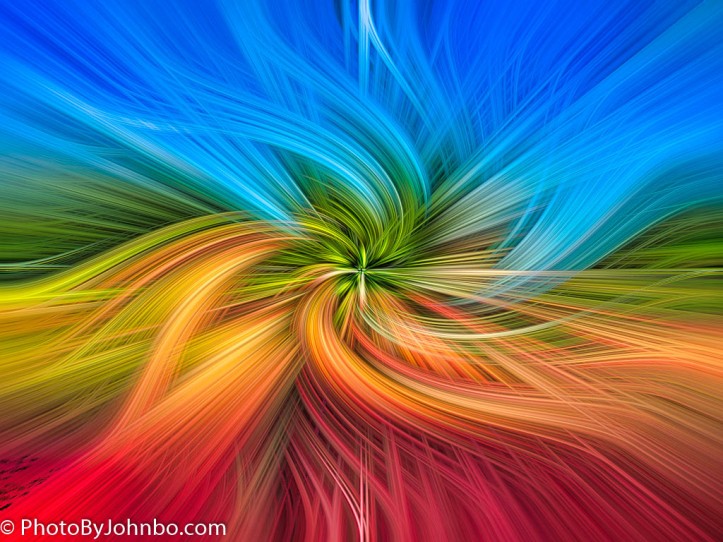
In 2016, I discovered a YouTube video that taught a Photoshop technique that creates what the author calls “twirls.” My opening photo is one of my attempts at creating a twirl from a typical image. I learned in that process that some images make better twirls than others. Incidentally, one of the twirls I created almost mirrors a color wheel. The colors are not in the proper sequence but are primarily present: Green-Red, Orange-Blue, and Yellow-Violet. I enhanced the twirl’s colors by increasing the clarity and saturation in the final image.

That twirl was created using the processing technique I learned in that YouTube video. Many photos don’t create such a dynamic color set in the twirl process. Still, look at this original photo from which the twirl was made. You’ll see those complementary colors, the reds in the planting beds and greens in the beds and trees, the oranges in the brickwork and the blues in the sky, the yellows in the sun-lit bricks, and the violets from that small bed of violet blossoms in the left foreground of the image. The algorithm even put small splashes of white in the center and upper parts of the twirl created from the marble statue in the garden.

We walked along a trail in a park in New Mexico. Fresh roses marked the intersections at prominent places to keep hikers on the right path. We didn’t encounter any other hiking parties, but I suspect there was a wedding party or other group activity the roses meant to direct guests. The pastel red of the rose and the green background desaturated by natural sunlight demonstrate that colors don’t have to be saturated to reveal a complementary relationship.

Egidio also noted in his post that complements don’t have to be exactly opposite on the color wheel. We wandered through the memorabilia items for sale at a Barrett-Jackson Auto Auction in Scottsdale, Arizona. I was struck by the beautiful colors on this display of antique soda machines. Though the colors aren’t exactly opposites on the color wheel, the image pops with bright colors.

My final photograph features a monarch butterfly, its usual orange desaturated to orange-yellow by the sun, sitting on the violet blossom on a thistle. Even though the colors aren’t quite opposites on the wheel, the juxtaposition of colors enhances the image.
That’s all for my response this week. To find out the photographic metrics and see the images in a higher resolution, you can find them in my Flickr album here. I may be slow in responding to comments from this post. We are beginning a cruise again this week, and my Internet time is always limited by the many other things I can do while touring by cruise ship. Please excuse any tardiness of my responses.
Thanks to Egidio for his challenge of complementary colors. I learned more about the color wheel and how specific color pairs enhance an image. Last week, Ritva encouraged us to take our camera for a photo shoot for her Shoot from Above challenge. I took the chance to visit a new place to photograph. Next week, Tina will host the challenge starting at noon EST in the United States. Follow her here to be notified when the challenge goes live. If you’d like to join in the challenges but aren’t sure how to get started, you can find some tips here.

Love that twirl photo, John. I’m no big fan of abstract but it’s extraordinary where you started from in creating that. Who would have guessed?
It was always a surprise. Photos I thought would make fabulous twirls would just as likely be “meh.”
I haven’t done the process in several years, but it was a fun exercise in learning more about Photoshop.
All of these work well for this challenge (I especially like the rose) but the standout image for me is the twirl! The colours are wonderful and I was amazed when I saw the original shot 😲
Wow, John! What a beautiful post and vibrant photos. You got some excellent examples of complementary colors to show us how everything pops when we use them. Thanks for the tip about the twirl effect. I’ll search for that in YouTube.
Thanks. I did a post about creating twirls during the quarantine. /2020/07/07/bid-twirling/
I appreciate the link. Thanks.
Interesting! I’ve never used photoshop so I didn’t know you could create a swirl like that. I like it!
I learned it’s all mathematical algorithms applied in a certain way. 🙂
What a twrirl! Math visualised.
All images are great color combinations.
Thanks, Nes!
Love the butterfly on the thistle, but that twirl is beautiful!!❤️
I’m not usually into abstract, but these were fun to create. Thanks, Sheryl.
I immediately loved the twirl John; even more when I saw what it was created from. Excellent. And those antique soda machines; how colorful. Now the machines are steel gray. And that’s called progress!
Progress in a gray wrapper… just like so many automobiles these days!
😎
The color twirl is fantastic John and I love the vibrant colors of the soda machines.
Thanks, I would have loved to take one of those machines home. They all work… but, you know… the price! >grin<
Yes, it would be a fun home accessory!
All your photos are brilliant, John and what an opener this week. Wonderful twirl 😀
Thanks, Sofia!
Great colors. Love the butterfly and thistle.
Thanks!
The color twirl is amazing, John! The rest of the images are bright and beautiful! It was so fun to meet you and Lin for brunch yesterday! Hope the rest of your trip is exciting! We’re on the road to home. Take care!
Safe travels.!
The twirl is a very creative way to show the colors. Plus – the nature photos are beautiful!
Thanks, Nora!
I did twirls a few times a few years ago. I forgot how much fun it is.
Indeed. Maybe we can recycle a trend. >grin<
I really liked the twirl, how cool. I am going to have to go and check it out. Lots of wonderful complementary colours John, beautiful.
It is a fun geometric exercise in Photoshop. Thanks, Leanne.
That last photo is wonderful: sunlight through the butterfly’s wings
Thanks, I.J. It was a nice happenstance to come upon that butterfly on our walk.
Beautiful images John, the colour twirl looks especially gorgeous! 😊
Thanks, Xenia!
I love the twirl! I will take a look and try it.
It’s a fun exercise, Patti!