Of the many composition factors in photography, this challenge focuses on Shape, Form, Texture, and Light. Though your images probably use multiple techniques that often include several factors in basic composition, for this challenge, consider these four elements. Choose to highlight one or more of these aspects in your response, and present one or two of your favorites. You can decide to focus on only one aspect or include examples of all of them. And you can either choose from your existing collection or venture out for a challenge shoot. We’re eager to see your top picks that utilize any of these techniques.
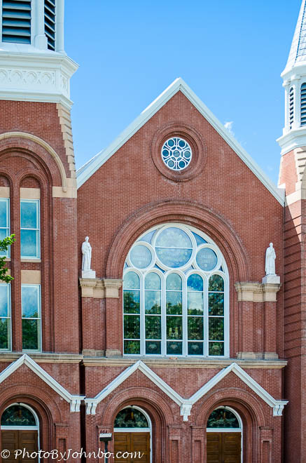
Architects often use repeating basic shapes in design because the repetition is pleasing to the eye. Photographers often capitalize on the architects’ work by focusing the camera to maximize the repetition of shapes. Saint Mary’s Catholic Church in Fargo North Dakota is an example of an architect’s use of triangles, circles, rectangles, arches, and other basic shapes. In this composition, I focused on a major section above the entrance doors to the church.
On an excursion train in Georgetown, Colorado, we were on a siding waiting for the engine to be switched from one end of the train to the other. As the engine went by, I captured a shot of the engineer at work. This photo turned out to be one of my favorite compositions, mostly because there are several repeating rectangles in the image with the engineer being framed by the open window. Even the 111 painted on the engine represents nested rectangles.
The difference between shape and form can be muddy, but artists typically consider shape to be two-dimensional while a form is three-dimensional. An obvious comparison might be that a triangle is considered a shape and a pyramid is considered a form for the purpose of composition. In the photo above, the architect who designed the atrium of the Heritage Center in Bismarck, North Dakota used a 40-foot by 40-foot cube form as a design element. The nature of the cube is reinforced by the steel rectangular frames around the window panes in the glass and metal structure.
Artists and photographers also consider organic forms and landscape photographers work for years to master organic compositional techniques. Flowers are one of my favorite organic forms as subjects. Removing color from the photograph allows the viewer to focus on the form of this beautiful lily.
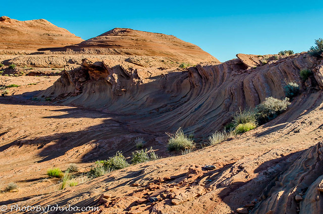
Adobe addresses texture in photography with this statement, “From moss-covered stones to prickly cactuses, texture images entice viewers, create moods, and communicate ideas…” In the desert near Page Arizona, the sandstone has been sculpted by wind and water for centuries. As I was hiking in the desert, I noticed the effects of wind as it molded the relatively soft rock into what can best be described as a wave. The wind took centuries to create in sandstone what it does in minutes to the water in the world’s oceans. There are many unique textures created by the elements in the composition, but the most interesting to me was the sandstone wave.
We enjoy visiting caves (if they aren’t too steep or strenuous). The Grand Cayman Island features a network of caves known as the Crystal Caves. There is also a Crystal Caves in Bermuda. That complex is still on my list of caves to visit. What I enjoy about caves is the myriad of textures found on the surfaces (which we are relentlessly reminded we cannot touch). The cave in the photo above is at ground level at one point and all of the textures in the walls and ceiling are easily visible in the sunlight streaming into the cave entrance.
Photos wouldn’t be possible without light and since the first cameras, capturing light is what photography is all about. We work with artificial light, await the perfect natural light, and are disappointed when the expected magical light doesn’t appear.
If you look up Compositional Tools on the Internet, you might not find a reference to light as a tool of composition. Yet light and shadow are used along with all of the other compositional tools to help us see the photographer’s vision. We position the camera and a light source to enhance the look of a portrait. We might even introduce equipment to create shadows in specific places to set a mood that would be entirely different if we did everything else exactly the same, but didn’t manipulate the light. We might position our camera in such a way as to create a backlight that might ultimately change the composition in its entirety.
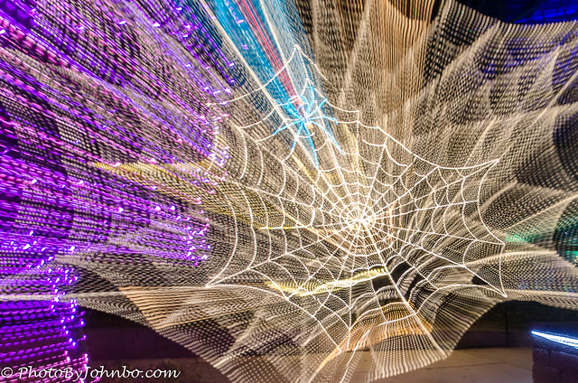
Sometimes light is the main subject of our photos, especially at sunrise and sunset… but I am getting ahead of myself. Sometimes it’s fun to have the light as the main subject. In the display above, I captured a spider web of LED lights on display. To add an unusual effect to the image, I chose a longer shutter speed, pressed the shutter, waited for an instant, and then cranked the zoom lens all the way to the full zoom position. That momentary pause captured the bright LED design, and the zoom created light trails that expanded outward. It was a fun experiment.
Ah, those magical sunsets when the light is perfect, or nearly so. What better way to conclude this challenge? Oh, and did you notice the triangular shapes in this composition? The sails on the boat in the center and the mast and ropes on the other two boats form triangle shapes. Even the lighthouse and the terrain on the right form triangles.
You can check out HD versions of the images here via my Flickr site. Last week, Ritva challenged us to do some Window Shopping, a fun and interesting way to renew my hand at street photography and share a few favorites from my gallery. Next week, Ann-Christine will be our host for the Lens-Artists Challenge. Be sure to link to her page so you don’t miss the challenge post on Saturday. If you’d like to respond to our challenge each week and want to know how to get started, check here.
John Steiner


[…] Lens-Artists Photo Challenge – Tools of Composition […]
Hi John. I really enjoyed your post, photos, and this challenge. It really helped me analyze what makes a visually-appealing photo. Your image of the train engineer is a favorite of mine, too. Your landscapes are great, but in fact, ALL your images really illustrate the tools beautifully. Here’s a link to my post in case the pingback doesn’t appear:
Thanks, Patti!
Great challenge and images! Love the crystal caves, especially.
Thanks, Sandy!
Welcome!
John, these are inspiring examples of shape, form, texture, and light. I love the spider web, but I don’t think I have the technical skills to do something like that. Fabulous shot, though. The church shapes are excellent and well accented by the white paint against red brick. The unique cave picture could inspire any writer or artist. It’s got “other-wordly” written all over it!
Thanks, Marsha! That church composition was also an example of cropping to emphasize the wide variety of shapes in the design. It was a perfect example of the technique.
I agree. The cropping took out any extraneous material and allowed our eyes to focus on the shapes set apart by the contrasting colors. So well done. I’d better go back and see what I did for shape this week. My post publishes tomorrow as usual. 🙂
[…] Lens-Artists Challenge #289: Composition […]
[…] John leads the challenge this week, and wants us to focus on the importance of Shape, Form, Texture and Light in our compositions. I guess most of us do, but without thinking about it. This tunnel in Eze, France, is smoothly showing off all these aspects. I simply take photos of what I find a beautiful view. […]
[…] The theme for the weekly Lens-Artists Photo Challenge #289 is ‘tools of photo composition’. Rain on a window distorts the sharpness outside, and adds something extra to the shape of the trees on this wet, Winter day. […]
[…] Lens-Artists Photo Challenge: Tools of Composition […]
[…] Lens-Artists: Tools of Composition (Shape/Form/Texture/Light) […]
The Heritage Center has impressive architecture, John. Also liked your picture of the Crystal Caves. What a cool looking place!
Thanks! That is a great building design. The architects went above and beyond.
[…] that much money because we took advantage of other activities. For this week’s challenge, John of Journeys with Johnbo has us exploring some tools of photo composition, specifically shape, form, texture and light. My […]
Here’s mine for the week
Thanks, Nora!
[…] John is this week’s host for the Lens-Artist challenge […]
This is a lovely challenge John! Great photos to showcase what the challenge is all about!
Here is my entry:
Such an interesting theme John – I’ve enjoyed seeing all the posts it’s triggered from others 🙂 I’ve not previously thought about the difference between shape and form, your explanation makes a lot of sense. I especially like your ‘light’ examples – the spider’s web LED shot is really effective and that yellow sky is great for silhouettes! I’m late this week – you can blame my holiday (jet-lag, mountains of photos to sort) but also I wanted to double-dip with my Monochrome Madness post as I’d serendipitously already picked ‘texture’ as its theme: https://www.toonsarah-travels.blog/gallery-monochrome-madness-seeing-textures-in-black-and-white/
Thanks, Sarah! I skirted the line on the edge of too difficult. I see people have found some great examples.
Beautiful photos and a post full of insight, John, thank you!
Thanks, Yanti!
[…] week the Lens-Artists are playing with composition. John at fireslaegrep.lol asked us to explore four aspects of composition; light, shape, texture, and form. These factors […]
[…] for Cee’s FOTD, and Lens-Artists tools of composition, and Monochrome […]
[…] LAPC – Shape, Form, Texture and Light – hosted by John Steiner Photos by Johnbo […]
[…] is my entry for guest host John of Lens-Artists Photo Challenge with the topic of Tools of Photo Composition like Shape, Form, Texture, and […]
Hi John, What a great theme and photos for this week. I remember watching the Georgetown train couple the engine to the cars. I can still see it vividly in my mind. It was a fun experience.
Here is my entry for the week.
Thanks, Cee. I want to ride on the Georgetown again. Durango is more spectacular, scenic-wise, but the Georgetown trip has its own special beauty.
[…] week for the Lens-Artist Challenge, John invites us to focus on the tools we consider when taking photographs: Shape, Form, Texture, […]
Your explanations and examples brought a tricky subject to light. But I’ve decided to bottle out and take an easier route by focussing on texture alone. Your sandstone wave and crystal cave set the bar high. Here’s my post: https://margaret21.com/2024/03/06/textured-monochrome/
[…] areas to view the fantastic pieces on offer. Many of the photos also work well with John’s Lens Artist Challenge this week too, which is all about light, shape, texture and […]
Thanks John, I hope mine meet the challenge!
I’ve already checked them out. You truly did meet the challenge and shared some beautiful public art.
Thanks John 🙂
Your great post helped me to get started and I followed your lead with mine. I really enjoyed the organic forms.
Thanks, Ritva!
This is a very interesting challenge, John. I have enjoyed seeing so many posts and comments, and your explanation of the four composition elements was well done and made it easier to pick photos. Your own examples are excellent – I especially loved the light capture! Thank you for the lesson!
Thanks Ann-Christine!
[…] entry for the lens-artists challenge: Of the many composition factors in photography, this challenge focuses on shape, form, texture, […]
[…] Lens-Artists Challenge #289 – Tools of Photo Composition […]
Here’s my addition to the challenge, John!
John, like you, the photo I like the best is of the engineer. A beautiful picture and it tells a great story! Your challenge this week is an interesting one and must admit I learned something new when putting it together! Thank you for that and here is my post: https://mycolorfulexpressions.com/lens-artists-photo-challenge-289-tools-of-composition/
Thanks, Sylvia! I’m happy people have enjoyed the challenge.
[…] More of the Lens-Artists Photo Challenge: Tools of Composition. […]
[…] John’s LAC challenge this week, he asks us to look at the many composition factors in photography – […]
[…] Lens artists photo challenge […]
[…] the buzzer for this week’s challenge! This week’s challenge, presented by John, presents an opportunity to showcase examples of shape, form, texture, and […]
[…] This post is part of John S’s LAPC #289-Tools of Photo Composition […]
An inspirational challenge.
Loved it!
Great examples!
Geometric form.caught my attention!
Capturing light- my fav.
Thanks, Philo. Your response hit the mark!
You are welcome, John.
[…] Lens-Artists Challenge #289 – Tools of Photo Composition 2023.11.01 Inside Seoul Square (in front of Seoul Station) […]
[…] Many thanks to our host John for the challenge Lens-Artists #289 – Tools of Photo Composition […]
[…] Ann-Christine is this week’s host for the Lens-Artist challenge […]
[…] entry for the lens-artists challenge: Of the many composition factors in photography, this challenge focuses on shape, form, texture, […]
[…] The theme for the weekly Lens-Artists Photo Challenge #291 is ‘Cityscapes’. The first sun got people out to enjoy the rays while having a drink on the junction of the Oude Rijn and Nieuwe Rijn in Leiden. On the right De Waag, the weighing house. […]
[…] The theme for the weekly Lens-Artists Photo Challenge #291 is ‘Cityscapes’, The view on the public transport hub and adjacent high risings. […]
[…] Patti is this week’s host for the Lens-Artist challenge […]
[…] Sofia is this week’s host for the Lens-Artist challenge […]