This post is part travel and part cellphone photography. In early December, I looked at my photo gallery on my Samsung S20U. A dialog box opened up to let me know that there was an update to the photo editor app on the phone. I went ahead and downloaded it, though I have seldom used it.
It was at that point that I decided to check out some of the editing options in the program. One menu option that I noticed is “Style”. It is here that I found some interesting image filters that reminded me of the artsy filters available in Photoshop. While I am not a fan of most of the filters, there are a few that I found interesting to experiment with as I reviewed a few of my recent photos.
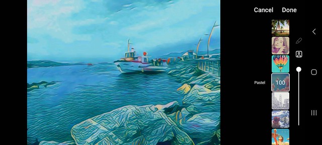
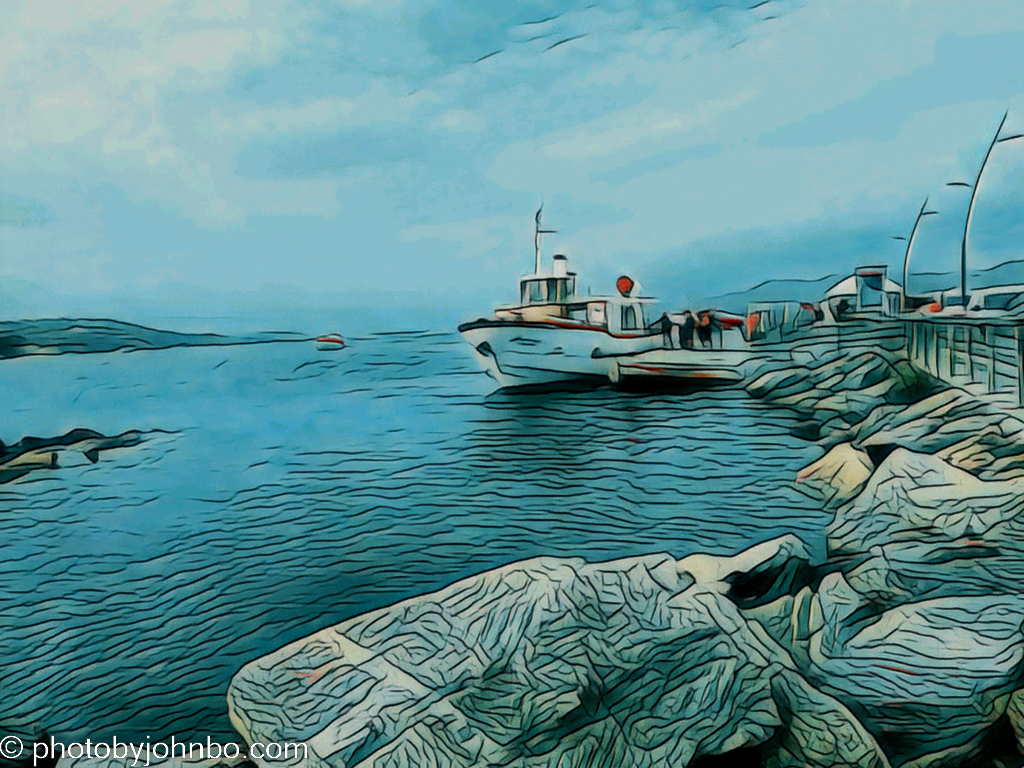
One of the first things I learned is that all styles don’t work with every photo, and just because one style works well, that doesn’t mean other styles will work on that same image. This image is a photo of people getting onto a tour boat at the harbor in Saint Tropez, France. I love how the “Pastel” filter uses “pencil lines” to emphasize the structure of the rocks and the water. The slider next to the image style choices allows the filter to be applied partially. The 100 in the filter box indicates 100 percent application of the filter. If the style is too strong, reducing the percentage will lessen the effect. For comparison, here is the original after I moved it to Lightroom Classic and Luminar Neo and adjusted it as I would normally.

All of the filtered images shown here have the filter applied before downloading from the camera. One thing I discovered the hard way is that if you choose “Save” at the top menu, you’ll lose the original image as it’s erased as the filtered image is saved over it. In the menu where you find the Style option in the app, there is Save A Copy that will preserve the original. That’s how I kept all of the original images in this post for normal processing.

I ordered a bloody mary drink at the hotel we stayed at in London. When I asked what kind of vodka he used to mix the drink, he picked up a bottle of Belvedere to show me. I took a quick snapshot. It’s a photo that I probably wouldn’t have otherwise shown, but I thought this pencil sketch filter called “Blue Ink” made for an interesting image.

Part of my interest in this experiment is the direct result of a blog I’ve been following. I. J. Khanewala completed a 16-week series on cell phone cameras, their artificial intelligence, and the techniques of computational photography used to bring us quality results to our cell phone pics, (and sometimes not-so-quality results as well.) Here is a link to the first post in the series. I found the study of this technology to be fascinating.
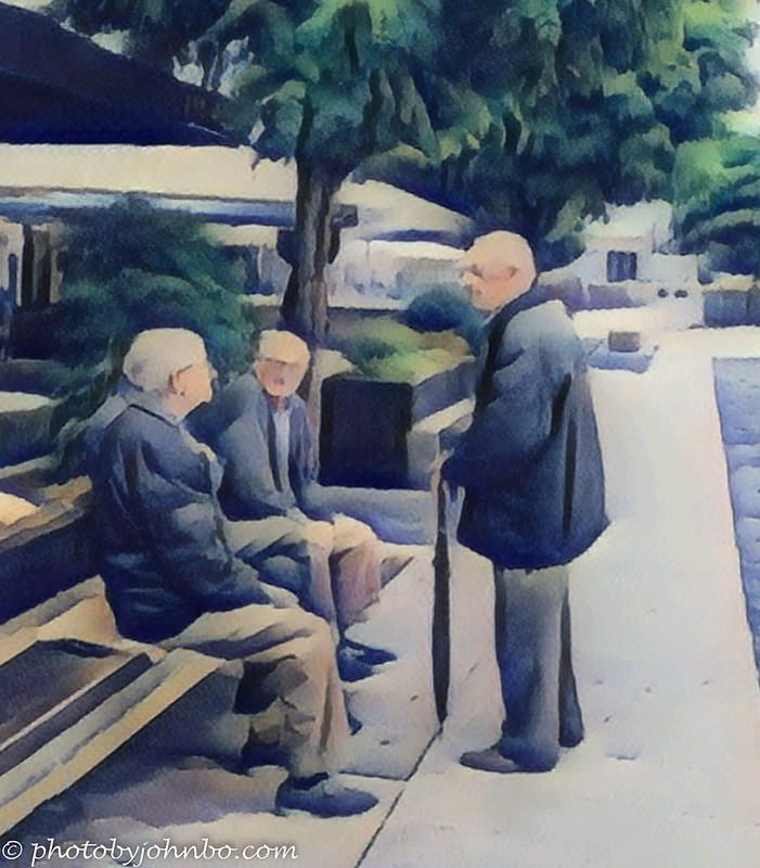
At Betanzos, Spain, I happened to see four gentlemen in deep conversation on a bench in front of a restaurant. (One of the men is hidden behind the first seated person.) I used a style called “Watercolor” to give the image a bit of an impressionistic look. It’s probably my favorite image in this series.
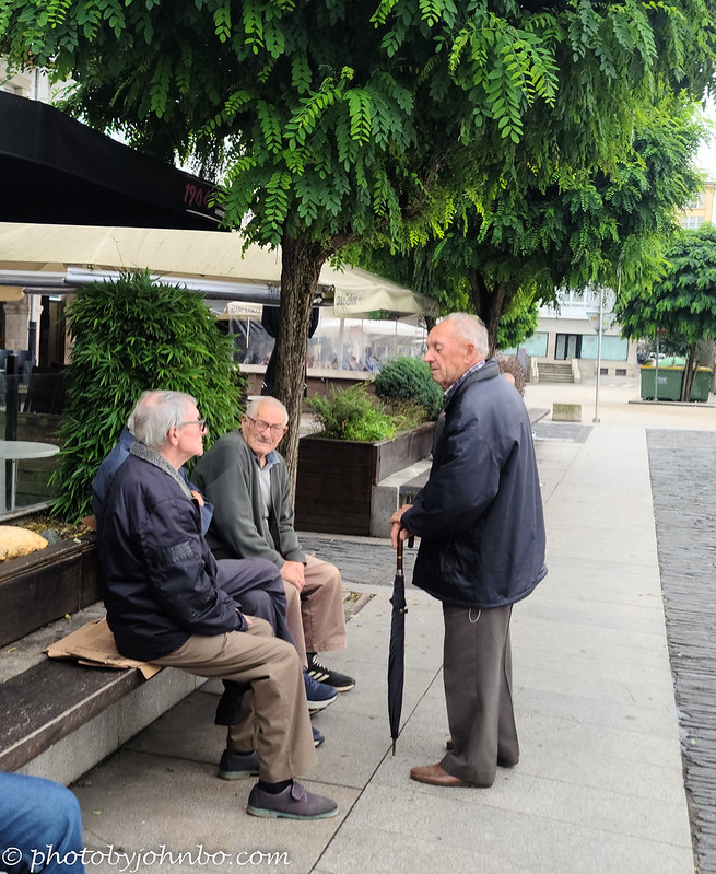
In the unprocessed photo, the fourth gentleman’s crossed legs in dark slacks is visible between the other two men. He was so well hidden, I didn’t notice him when I took the photo. There also happened to be someone sitting on the bench in the extreme foreground. I cropped him out in the original photo, but to keep the composition focused on the conversation in the center of the image, that knee in the foreground needed to stay. Once I transferred the water color image to my computer, I used Luminar Neo’s erase function to remove that knee.
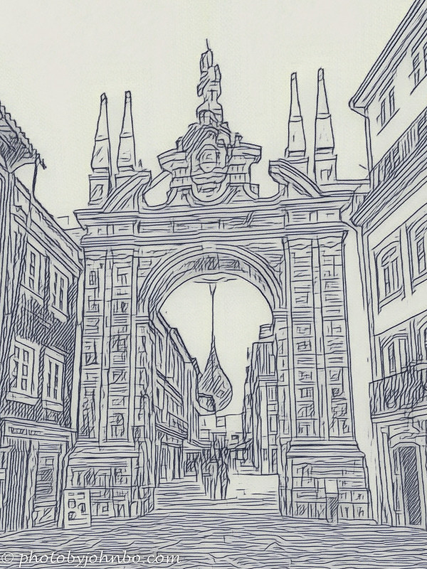
There is an interesting story of how the walled city of Braga has a permanently open gateway after many decades of being completely closed off to protect the city from mauraders. I’ll tell that story in another post. This line art treatment turned out better than the bartender image, I think. I learned by experiment in this process to try the different styles to see what works and what doesn’t.
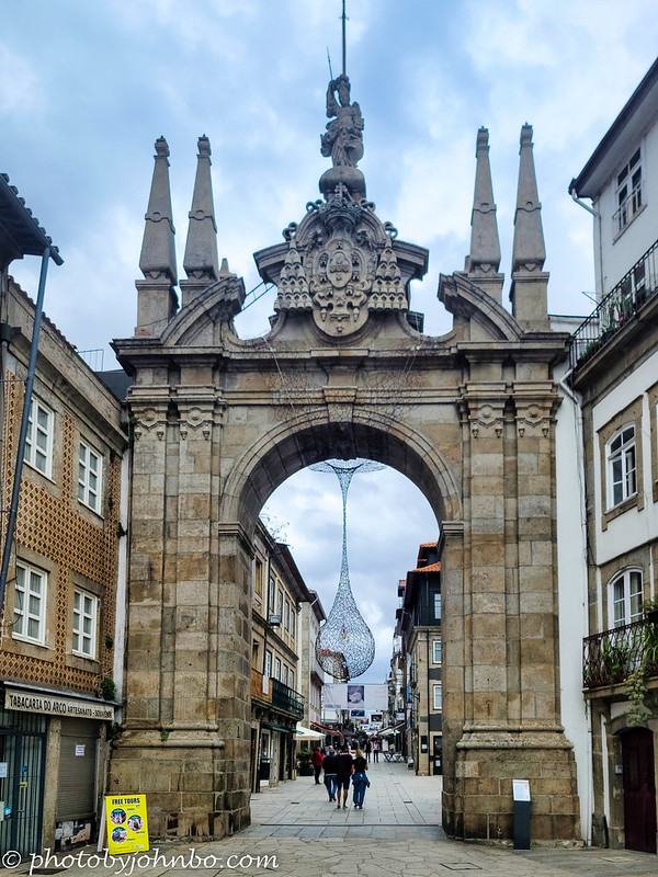
This final image of the series converted quite well to line art. I like how the programmers of the tool made the lines somewhat imperfect mimicking the freehand nature of a human artist. I also like how the people inside the gate are just a series of impressionistic lines. This image had some geometric distortion from shooting upward to capture the top of the gateway. Once I’d loaded both the original and line art versions of the image into Lightroom Classic, I used Lightroom’s geometric tools to straighten the vertical lines keeping just enough lean to keep the perspective looking natural.
Don’t be surprised if, going forward, you see my use of the style tools in future posts. I will say that the first image I converted happened while I was watching the Elton John farewell concert on Disney+. I snapped a photo of Elton in closeup at the piano with a reflection of his face in the shiny surface of the piano top. The line art image is superb. I decided not to share the image here as it’s a derivative work from a copyrighted source. I am not about to go through the hassle of trying to get permission to use an image captured from the TV screen, and I’ve been told that when it comes to the legal issues around Disney properties, “Don’t mess with the mouse.”
The Blue Ink tool did a lot better job on Elton’s face than the image of the bartender above, it had a lot less detail in the face than the image of the bartender making the image really look like a pencil sketch. Don’t be surprised if, going forward, you see my use of these style tools in future posts. The conversions are fun and easy. It takes but a moment to cycle through the many options to find a style that you might like. Just be prepared to find that none of the styles in the kit work with your image.

These are great John. The first one is so good. The line drawing of the barman makes him look a bit serial killer or a Boris Karloff type.
I must agree with the gentlemen chatting, that is excellent 🙂
Brian, I had similar thoughts about the barman. It’s probably my least favorite conversion, and it shows that not all images are complimented by one specific technique or another.
Fortunately the software provides a preview, and you can do a “Save a copy” so that if you don’t like it, you won’t ruin the original.
Interesting, quite good results. The harbour and the conversation are my favourites.
I really liked the Gentlemen photo. I featured it as one of my favorites of 2022 that was unpublished. 🙂
I used to do a lot of this sort of thing but have got out of the habit. You’ve inspired me to play around again some time soon! I’m not sure about the line drawing effects here but the two colour images work really well 🙂
The tools are interesting to play with, and sometimes surprisingly positive results.
Interesting comparisons John.
Thanks, Anne!
😊😊
I think the line drawings work well. I’ve tried doing it earlier by using the edge finder algorithms on various editors. Glad to see it as a setting on a new editor.
When you think of the complicated structures needed to create line drawings from images, the AI is truly amazing.
I love these kinds of filters, you picked some great ones, John! Another one I use is Painnt app on my phone or tablet. I get the paid one for a whopping $10 a year 🙂
I’ll have to check that one out. I’d like to find something, though, for my PC.
I prefer using the PC too. Please share when you find something (and inexpensive)!
Will do!