This week’s photo challenge asks us to pay attention to lines. Being somewhat literal, my opening photo features two guys making lines. OK, I’m not so sure that’s what Cheri Lucas Rowlands meant when she suggested that we share compositions dominated by lines. But don’t take my word for it. you can read her entire challenge post here.
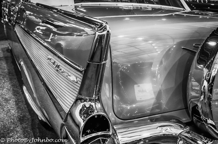
Some lines are unmistakable. I miss those days when an automobile manufacturer could be identified by its classic lines. From the triple bar tail lights on the Ford Mustang to the classic tail fins on late 1950s model vehicles like the 1957 Chevy Bel Air above. Though the triple-bar tail light still identifies a Mustang, most cars built in the last decade are almost unidentifiable in their sameness. The classic lines are all but gone in favor of aerodynamics and better fuel economics.
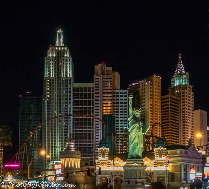
They don’t call the outlines of tall buildings in a city skylines for nothing. even the Las Vegas Hotel, New York New York’s mocking architecture is as easily identifiable as the real skyline of the city. In the skyline photo, on the right and far in the background, the lines of Diamondhead identify this skyline as belonging to Honolulu, Hawaii.
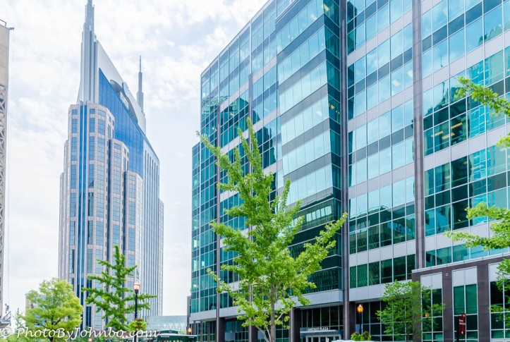
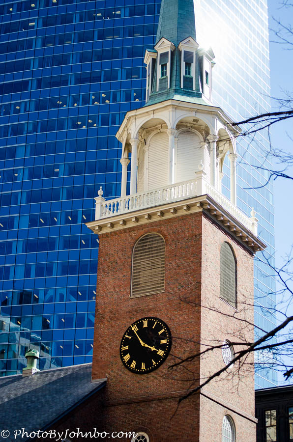 Lines define architecture in other ways as well. This image of the pre-revolutionary Old South Meeting House in Boston is juxtaposed in front of a modern skyscraper. Arches dominated older designs where modern steel structures don’t require the strength or beauty of the arch in engineering as demonstrated in the image from Nashville, Tennessee, below.
 Nature creates her own designs as shown in the images below. Of all the trees I’ve seen in my life, my favorite is the mesquite tree. Branches twist and jut in a never-ending variety of design. Over the millennia, natural erosion reveals the layers composing the internal structure of mountains of stone. The layered construction of Tent Rocks in New Mexico displays the characteristic lines of volcanic rock.
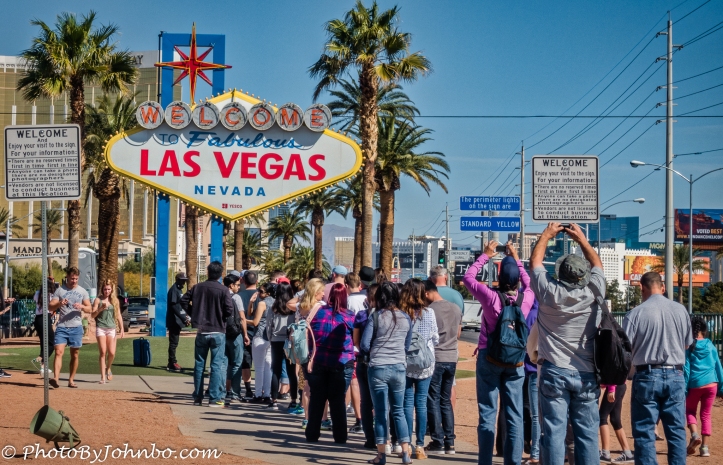
I close this post in the photo below with a line, a queue actually. These folks are standing in line to get their unobstructed photograph of the iconic Welcome to Las Vegas sign.
I submit for your review, a gallery of images featuring this photographer’s favorite examples of the use of lines to draw the viewer into the photograph, or to simply marvel at the design and structure of the subject. In most browsers, you can click on an image to enlarge it and to scroll through the gallery.
John Steiner






You really were creative with this challenge! When I heard the challenge and “lines” I just thought of straight lines, like stripes lol. You even took it to a literal sense “Standing in Line” Good ideas!
Thanks. It was a fun challenge and one I had plenty of shots to choose from.
You give good line! Well played. Aerodynamics, and fuel efficiency may have played a part in the sameness of vehicles, but probably less so than just good old fashioned regulation intervention. Most car companies have been taking massive losses with their “green cars” but making up for the loss with sales of regular old SUV’s… Which continually cracks me up. Green cars, electricity, guess what, mostly still comes from burning coal. How very green indeed. Hahaha
fine selection.
[…] Journeys with Johnbo Weekly Photo Challenge – Lines […]