
This week it’s Sofia’s turn to challenge us. Her theme is “Mood” and she sets the parameters with, “So, for this week, I challenge you and myself to think of mood, how to convey and create an emotional reaction to your shot. That can be accomplished by capturing situations or occasions, photography styles or people and their feelings.” You can read her entire challenge post here.
My opening photo is an example of taking a snapshot and giving it a more moody and mysterious, if not menacing, image. I cropped it tight with the crocodile’s eye in the dead center of the composition. I then lowered the exposure in post-production by two stops. With the lowered exposure, the color saturation is exaggerated. Sometimes I just lower the saturation across the entire image, but lately, I’ve used the HSL sliders in “S” (saturation) mode to reduce each color value to zero. That allows me to raise each color slider to see what part of the image is affected. By operating on each color individually, you have an opportunity to tweak the coloration to emphasize as you see fit. Though the croc appears to be relatively gray, it is composed of several colors easily identified with slider manipulation. Once I had the croc color as I liked it, I then adjusted greens and yellows to give the surrounding plants and water a subtle green appearance.
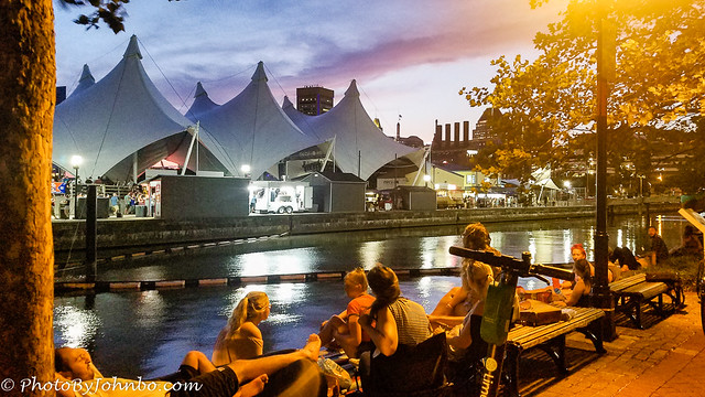
In the blue hour, a concert was underway in the tents across the river channel. It didn’t take long for the seats outside the nearby hotel to fill with passers-by to take advantage of the music without the hassle of fighting the crowds and having to pay admission. The disadvantage, though, they didn’t get to actually see the performers. The original image was lit strongly by the amber street light just above them. I added some contrast and then pushed the saturation of the amber colors up just a bit to highlight the foreground.
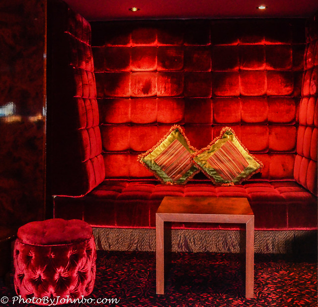
Sometimes the available lighting sets the mood for an image without the need for much processing at all. This image from 2013 features the comfortable spaces in the lounge. I did almost nothing to the exposure in post-production but increased the contrast to emphasize the plushness of the tufts in the seat and ottoman.
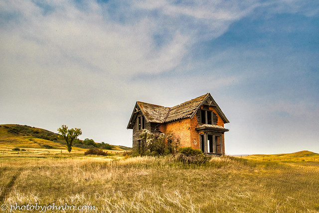
This abandoned house is one of the remnants of a ghost town in southwest North Dakota. I took advantage of the house being on a small rise in the terrain and that allowed me to capture from a lower angle and include some interesting sky.
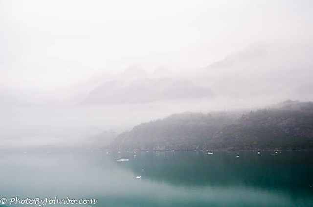
By reducing the exposure and dropping the level of highlights in the image, I was able to add detail in the mountains behind the shoreline in the front. The two images have a very different feel. Feel free to comment on the version you prefer.
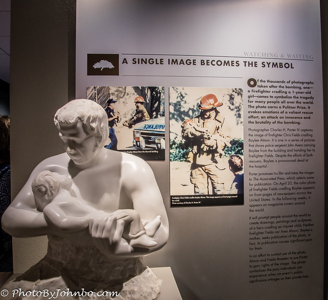
A photo of a fireman cradling a 1-year-old victim won a Pulitzer Prize and became a symbol of the tragedy.
The sculpture was created by artist Rolf Kriken and was dedicated six years after the Oklahoma City bombing. It depicts a firefighter carrying a limp and bloodied child in his arms, a powerful symbol of the heroism and sacrifice of first responders who risk their lives to save others. Both the image and the sculpture are evocative of the theme of the display.
By removing the color, decreasing the exposure, and adding contrast I believe the image better tells the story. What do you think?
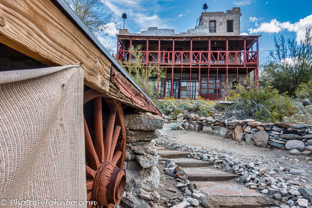
There is an interesting and unusual story about how this castle came to be in the shadow of South Mountain, Phoenix, Arizona. A low-angle view of the unusual building helps to add to the mystery, I think.
The conversion to black-and-white and some of the effects in OXO’s Silver-Efex make the image even more mysterious. Do you have a preference for the mood set in either version of the castle?
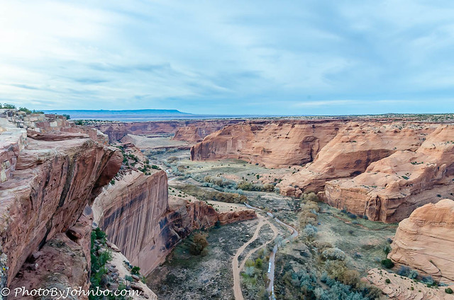
My first attempt at processing this image of Arizona’s second-most magnificent canyon was OK, but it appeared somewhat bland and lacking in “punch.”
According to the definition from Adobe, split toning is a post-processing technique where the highlights and shadows of an image are toned with different colors to create a specific mood or effect. Manipulating the HSL sliders is one way to accomplish this. In this image though, I used masking of the sky and landscape to tone the terrain and sky differently. I maybe had the terrain a bit oversaturated, but I like the artistic effect it gave the image… don’t sue me, but tell me what you think.
Sofia’s challenge pushed me to think about how a photo can reflect a specific mood, or by post-processing change the mood of an image entirely. I realized as I looked through my own collection of images, I don’t often think of mood when composing in camera. It’s only when I get home and start to work with what I brought back in the camera that I probably should have thought more about mood when I was composing the image. It would probably cut my post-processing time drastically.
For those who are inclined to pixel peep, as usual, I’ve posted the images in HD on my Flickr site here. Next week, I have the honor of hosting the challenge. It will be posted on Saturday, May 13, at noon EST. If you’d like to get started following the challenge and want a starting point, check for details here. I will see you next week!
John




I like the B&W of the castle 🙂
Silver Efex 2 always does a nice job and has tools that can really enhance black-and-white. Thanks, Brian!
Your second version of Canyon de Chelly is definitely more punchy, but to my eyes the shadows are too saturated. It is going in the right direction, though.
I liked your “abandoned house”
Thanks! I did probably hit the saturation a bit strong there. 🙂
They are all skillful responses to the challenge, but I like “Abandoned house in Sims North Dakota” the best. It conveys various moods …
Thanks, Hien!
Nice interpretation of this challenge John. I like the black and white versions of both pictures. And, yes, I think the terrain of the canyon is a bit oversaturated, but not by much. You’ve done great work with this challenge.
Thanks, Anne. I was reminded with this challenge that I should review my latest images for good B-W potential. 🙂
😊
What a moody series, John! Thank you for showing us the changing mood through lights, colors, and B&W. The last one is moving; “a powerful symbol of the heroism and sacrifice…”, indeed.
Thanks, Amy. I really need to keep mood in mind when I take the photos in the first place.
A really interesting post John, both for the images and the descriptions of your processes. My favourite is possibly the abandoned house but I do like the moody edit on the crocodile too. As to the images where you offer us two versions, in all cases I agree that your edited ones are the better. The B&W of the fireman statue and the mystery castle both work better than colour I think, and I like your punchy version of the Canyon de Chelly shot (not too saturated for me) and the low key Glacier Bay edit bringing out the distant mountains. Good work!
Thanks, Sarah! Sofia created a fun challenge for post-processing. I’ll be playing with the concept of mood for future processing, and I will try to think about mood a little more often before clicking the shutter.
Great photos and they provoke so many moods. I remember the OKC bombing. I lived in Colorado at the time. 😀
Thanks, Cee. That museum is a somber tribute to those who were lost.
This was a good read John, with information to make notes of.It was nice to see duplicate images to see your post editing work and also to see when ones WE might like better. Most photos are relative to interpretation as you show. On your Glacier photos I like them both but for different reasons. The softness of the fog in the first one brings a softness to the photos, but the second gives us a better idea of what the landscape looks like.The firefighter sculpture was immediately more impactful to me in B & W. Good call. For me, The Mystery House is such a mystery all the time. lol. The coolest place. Havent been there in a bit. I think my grandkids would like it.It is a great place to dream.The croc edit was fantastic. and I think my favorite photo was of the abandon house. It looks so content sitting on its hill..
I was moved by the picture of the fireman!
That entire museum is moving. So sad for all the losses.
I think you found the perfect balance with this post. A lot of interesting info on post-editing and on the backstory of each shot. The abandoned house is my favourite for this week, it’s such an wonderful shot, although the crocodile is also excellent (and incredibly spooky). Of your editing, I think all images gained a lot with your careful intervention. I especially like the Glacier Bay ones.
Thanks, Sofia. I really enjoyed reworking some of the images for this challenge and sharing the others. Great theme choice!
Wow John, you really put some time and thought into this one and it definitely tells the story of moods and how photographic editing can make a difference. I was especially impressed with the change in your closing image. I also loved the red image which you did little to post-process but it’s stunning. Well done!!
Thanks, Tina! Fun challenge, for sure.
I love how you explain your editing process. It’s a great insight for someone like me, even though I limit myself to what the Photos app editor allows me to do. I love the low-key version of Glaciar Bay, butactually, the statue of the fireman cradling the baby, I like the first photo better. You’ve visited interesting places. Is this statue in Oklahoma City?
Yes, Dan. It’s at the Oklahoma City National Memorial & Museum. If you ever get the chance to visit, it’s well worth the stop.
Love the monochrome images especially
Thanks!
I can see you had fun with this one, John. And so interesting to follow your thoughts on every image. I agree with most of the others, B&W is perfect for moods and the abandoned house is so right for me. Loved the croc too. The most obvious enhancement for mood was the firefighter and child.
Thanks, Ann-Christine. I have received so many compliments about including some processing details, I will try to do that more often.
Good! If you feel you have time for it, I know it will be appreciated.
Great experiments and photos, John. I’m drawn to the 2 houses…in b & w. They are so expressive and convey the mood (mysterious, gloomy, spooky) so well. The alligator’s one eye is very chilling, too!!
lovely edits and nicely explained. To me editing is one of the most important things to do to create a mood
Thank you! I appreciate the compliments!
[…] Lens-Artist Photo-Challenge John:…Mood […]
Loved the abandoned house and the foggy coastal photos, John!
Thank you!