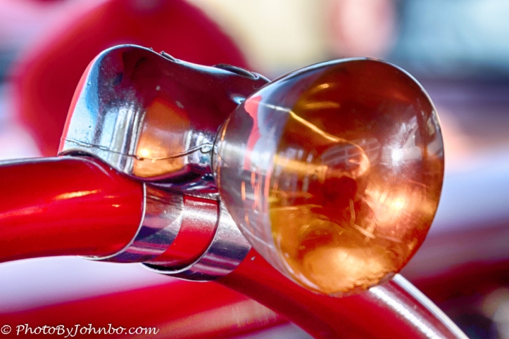
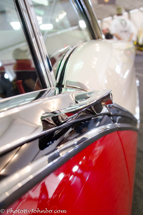
This week, Patti Moed asks us to focus our challenge lenses on the details. She featured as an example the intricate details of two architectural marvels showcasing intricate artwork in their construction. You can view the images and read her challenge post here. Hers are examples on a grand scale. For my response, I look to my galleries of classic car images captured in the last decade. The cars and their details go back much further than that. The opening image, for example, goes back to mid-20th century when steering wheel spinner knobs were all the rage on cars of that era.
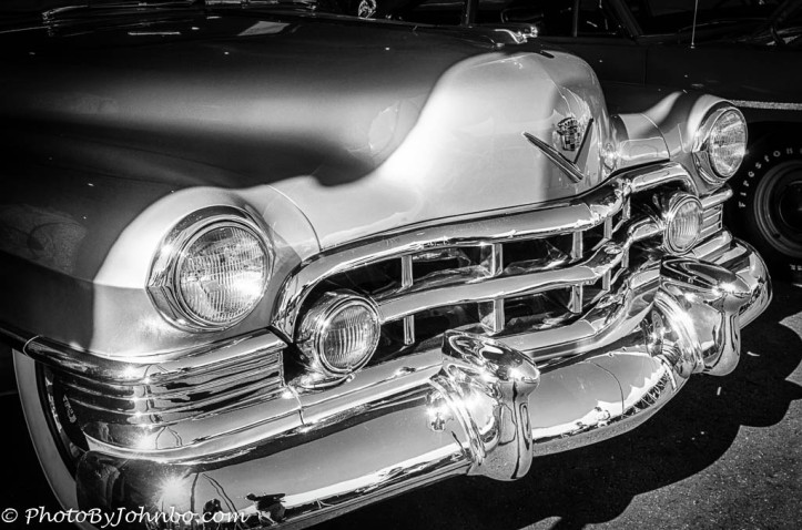 In the mid-1950’s, the American ideal seemed to be big, heavy, road smoothing land yachts. From the massive grills to the burgeoning tail fins of the era, heavy metal construction and bright chrome were the construction materials of the time.
 Speaking of tail fins, this late 1950’s model Oldsmobile was quite conservative in it’s modest integrated tail fin/tail light assembly. Surrounded by brightwork, the classic curves of the car body were accentuated by the straight lines of the tail fin extended as the body curves fell away.
Today’s door handles are often blended into the design of the side body molding. Contrast that with yesterday’s most common door handle design, a grab bar with a thumb-actuated latch button. This 1950’s era Ford typifies that common style element.
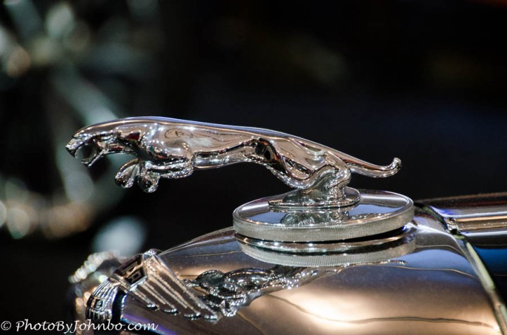 By the 1950’s, however, one element of style all but disappeared, except for a few notable exceptions. The hood ornament became the victim of vandals and eventually faded into disuse. One of the last holdouts, Mercedes-Benz, with their “peace symbol” style ornament was probably the most notable. It was not uncommon to find people proudly wearing the chrome ornament on a chain around the neck. The example in the image above was featured on the British-made Jaguar.
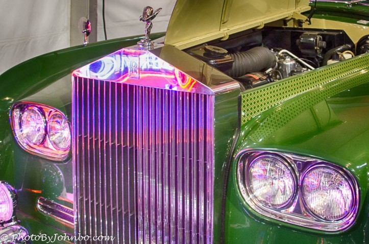 Like the hood ornament, in early automotive design, the grill and hood design work were advertising monikers of the automotive brand. Some cars were known for their complex grill design, but Rolls Royce preferred to keep the design simple. This beautiful green 1960s era model is an example of the simple and instantly recognizable design element underneath the classic Rolls Royce hood ornament.
I could go on at some length writing about classic design elements of the 20th century automobile. Today’s emphasis on aerodynamic design has all but thrown style out the window in favor of the wind-tunnel designs that are both energy efficient and light weight. Unfortunately that is what I believe makes cars no longer recognizable by their distinctive shape. It takes a look at the vehicle’s badge and nameplate to determine brand on most mass produced vehicles of today. That, I’m afraid, is our loss.
John Steiner
Wow… what a beautiful gallery of these classic car images!
Thank you so much, John for explaining the details. Fascinating!
Thank you for stopping by and for the compliment!
Always enjoy your car galleries! I suppose those spinner knobs helped a lot in the era of no power steering. I totally remember the bboy kids wearing the mercedes hood ornaments on cheap chains. Hahaha hope that never goes retro… I could never mess with someones car like that.
I remember using a spinner knob when backing up. It did seem to make things easier when peering over the back seat.
Beautiful examples John. While I agree re lack of style, I do think with our abuse of Mother Earth, consciousness of aerodynamics and emission-control must take precedence. Besides, our cars will be flying soon 😊
I can’t disagree. As much as I like the looks and style of those older cars, I drive one of the eco friendly hybrids and bemoan my own lack of panache. 😎
😊😊
Fantastic old cars.
Indeed they are.
Fabulous post, John. Your images capture stunning details and your prose is marvelous! We can tell how much you love/admire these classic beauties!
Thank you for the kind compliments. Indeed, I spend far too much time enjoying the classic beauty of older automobiles.
Ah, classic beauties in all their splendour! Thank you for explaining the details – and I must admit I go to car shows to see these old beauties…every year. But – I do think we are on the right track now to save Mother Nature as best we can. I believe some esthetics will find new ways of enhancing our future vehicles, and the old ones will always be there for show!
Indeed. The automobile is a technology that is intertwined with our history and collective experience.
John, beautiful pictures of forgotten details on the older cars. Thanks for sharing!
Thank you for stopping by and commenting!
Oh, you know I LOVE those car pictures!
I figured I might hear from you when I was writing this post. >grin<