This week, it’s Tina’s turn to select the theme, and she has picked one for which I could find many examples. She writes, “This week our challenge is focused on one of the most well-known and widely-used ‘rules’ of photography, the Rule of Thirds.” Indeed, the rule of thirds is one of the first rules of composition that I learned, and I’ve practiced its application since my high school photography days.
There are many descriptions online about the use of the rule for in-depth descriptions, but Tina used a simple grid illustration like the one above and noted, “Basically, the rule is a compositional guideline that encourages placement of your primary subject on at least part of three equal rows and three equal columns…”
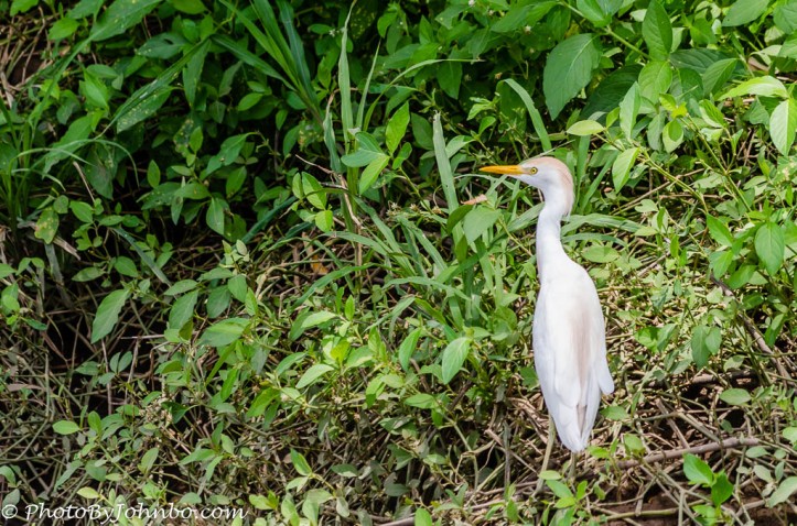
You may note in my opening image of the cattle egret, I’ve positioned the bird essentially over the vertical line that separates the center from the right third of the grid. For whatever scientific reasons described online elsewhere, the placement of the subject along or at the intersection of those lines, generally creates a strong, pleasing composition.
The rule of thirds is so popular with photographers, most cameras are designed to allow the overlay of a grid in the viewfinder so that an image may be composed in-camera with the rule in mind. I have the grid turned on for every camera that I own. It reminds me that a composition in-camera is often better than a re-compose in processing the photo. The above image features the symmetry that can be created while using the rule. The lower third of the image is along the painters’ feet which are also aligned with the yellow lines they are painting. The two men are placed along the left and right verticals of the grid and their heads are almost at the intersections of the grid in the upper, left, and right thirds.
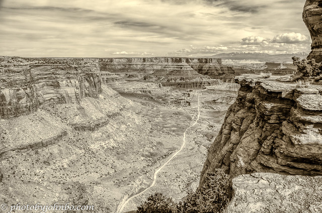
Landscapes lend themselves to the Rule of Thirds. This image captured at the Shafer Canyon Overlook in Canyonlands National Park is an example. The top of the canyon is placed along the bottom of the top third of the image. The canyon’s left and right sides are in the left and right thirds, and the road provides a leading line from the bottom through the image to direct the viewer’s eyes into the far reaches of the canyon.
Sometimes the images all but compose themselves into the rule of thirds. This image was captured from our seats off the first base line just past first base. My telephoto lens brought the viewer closer to the action. As an aside, I was always a bit disappointed in this image because the f/5.6 lens opening wasn’t large enough to blur the background. Before using this photo, I loaded it into Luminar Neo and used the Portrait Bokeh function to create an artificial bokeh. It did a great job of separating the umpire and the catcher from the background, but I had to bring the batter’s head and part of his torso into the foreground by manually tweaking the mask. All in all, the extra work improved the image by pushing the players into the foreground nicely. The image almost looks 3D.
On our stop in Costa Rica while cruising toward the Panama Canal in 2013, we took a Jungle Cruise excursion on the Tarcoles River near Puntarenas. At one point, our tour guide hopped out of the boat with a small bag of chicken parts and proceeded to feed a “friendly” crocodile. I won’t speak to my opinion of the guide’s sanity.
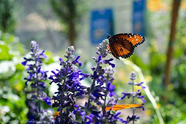
The butterfly in this image was placed at the upper right intersection of the grid with the row of flowers lined along the upper horizonal grid. Thanks to TIna for allowing me to share some of my favorite images that demonstrate the use of the Rule of Thirds. To conclude my post, here are a few more examples.
One last comment, it’s OK to break the rule of thirds for whatever creative goal you might have. For landscape photography, I’ve found it valuable in improving the composition of my images. All of these images are available in an album on my FLickr site. For pixel peeping and metadata details on the images, visit my Flickr album here.
Next week, it’s Patti’s turn to create the theme for the challenge. If you’d like to join in our weekly themes but aren’t sure how to proceed, look here.
John Steiner





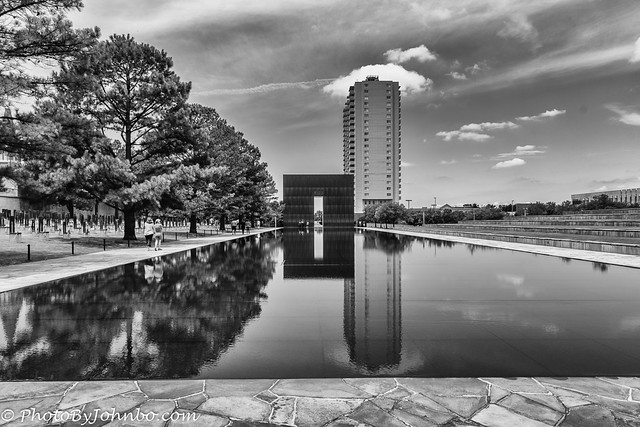

There are some stunning photos in here, John. Wow. I’ve been to the memorial in Ok City. So sad.
Thanks, Karen. I was so moved by the tragedy at OKC.
Wonderful images and examples of the rule of thirds! I really like the Arlington image with the bugler superimposed. Very creative!
Thank you, Donna!
Beautiful explanation.
So simple yet having profound impact.
Love your collection John especially Egret and the crocodile 🐊 one.
Thank you .
Thank you, Philo. That jungle excursion was one of my all-time favorite cruise excursions.
Welcome John.
Glad that you enjoyed this particular trip and had fun time.
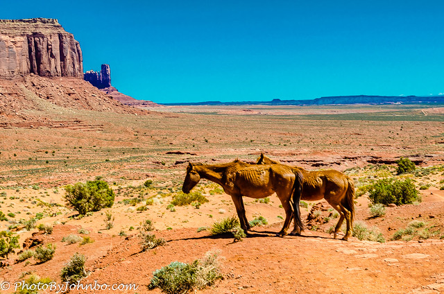
Beautiful applications of the rule of thirds! Those wild horses look like they haven’t eaten much since John Ford made his movies there. 😊
These were two of an entire herd we saw that day, probably 20 or so individuals. None of them looked very well fed. They are truly living off a barren land.
Very well said and shown as always John. Absolutely loved your superimposed bugler at the cemetery – that’s an expecially strong image!
Thanks, Tina! If there is a photography rule that I overuse, this is it. 🙂
Great images and examples for this challenge John!
A great selection of images and you make some good points about when to use the rule and when to break it 🙂 I really like your Canyonlands shot and that last one of Bodie Island. You mention leading lines – look out for my Friendly Friday challenge tomorrow as that’s the photo composition tool I plan to discuss. I’m sure you have some great examples – in fact, you have some here!
Thanks, Sarah. I will check out your post tomorrow!
Stunning photos demonstrating the rule of thirds, John! I particularly like the baseball pic!
Thanks, Terri.
All perfect examples and clear discussion of the “Rule”, John. I especially liked the Canyonlands and lighthouse shots. Those poor horses are so skinny!!!
Thanks, Janet. Those horses have a hard life.
These are all great examples – I have to say the man with the alligator is baver than I would ever be
You and me both!
This is a fantastic collection, not just to introduce the rule of thirds but as a collection.We were just talking of Shafer Trail yesterday. That evokes the best memories for me. I think my favorite photo was of the alligator feeder. It made me want to see “the next ” photo. lol. Hope he is still in one piece. The most moving photo to me was of the bugler at Arlington. I still cant get through TAPS without tears. Too many… This statue superimposed brings grace and a ghostly spirit that is so appropriate for Arlington.
Thanks, Donna! Our second visit to Costa Rica, I wanted to do that tour again to see if the guide might still be there. Unfortunately, by the time I checked, the excursion was full.
That turned out well as we visited a wild animal preserve which was far more interesting.
I’m sure, and it’s nice to do different things.
Excellent choices – and I LOVE the bugler image. Nicely done.
Thanks! It was a bit of a challenge, the first time I tried to superimpose part of an image on another.
Great photos! I love them all, especially the canyon photo. Perfect examples of the rule—very helpful. 😎
Thanks, Dawn!
Wonderful explanation of your methods and wonderful results. I agree–that the rule of thirds is especially helpful when I’m composing landscape shots. And I also agree that sometimes the rule has to be broken. 😀. Your image of the Oklahoma City memorial brings back a very poignant memory of the site. The lighthouse is on the other end of the emotional spectrum–a happy, summer shot.
Thanks, Patti. I really enjoyed finding images to share for this challenge.
John, such a great selection of diverse pictures showing the rule of thirds. Think my favorite is the bugler superimposed in the cemetery.
Thank you, Sylvia. I enjoyed finding and sharing the examples I found.