This week’s challenge is from Patti Moed. She asks us to focus on one of the basic “first steps” in bringing out the best in an image. She writes, “This week’s challenge is a chance to explore a photo editing technique and the benefits of cropping the shot. Show us how cropping helped to improve an image and create a desired effect. Include the shot “before” and “after” so we can see the difference.” You can read her entire challenge post here.
Of course, that first step might also end up being a later step as you evaluate the close-to-final image and discover a different crop might bring out a different look that might even change the photo’s emotional appeal.
As many of you know, the challenge is posted each week on Saturday, but I don’t get my response published until Thursday each week because of my other weekly posts happening on Sunday and Tuesday. I am writing this on Wednesday, even though I had my post all but completed over the weekend and scheduled for its Thursday morning automatic post. This introductory parenthetical comment is being added because I have really enjoyed the submissions by other challenge participants and their take on cropping. Probably the biggest take-away was the reminder from several others about the power of in-camera cropping. They have reminded me that taking a few extra shots at different distances gives you the power of cropping without the loss of pixels (and resolution) you might need for printing an image. Going forward, I will try to remember to crop in-camera before I trip the shutter and take more images with in-camera cropping in mind. Now back to what I wrote over the weekend.
There are several reasons one might crop an image. Six of them are delineated here. It turns out that I used two of those reasons in my opening photo. The six items listed in the article are:
Improve overall composition.
Focus on the main subject.
Remove distracting elements.
“Zoom in” on a subject.
Change the orientation.
Change the aspect ratio.
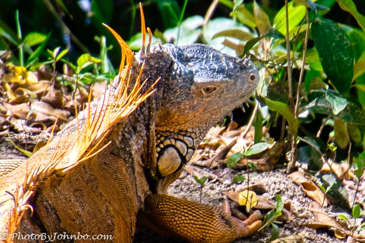
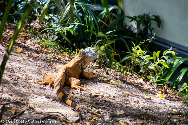 The original image of this mail Iguana was tilted and the subject was quite far away. The first thing I did in Lightroom was to rotate the photo to make the ground level. That fixed a technical error on my part. I could have opted for simply cropping to focus on the subject, but chose instead to “Zoom in” and create a portrait of sorts.
The one caveat about using “Zoom in” is that when you crop an image, you remove pixels making it a lower resolution image. The original image captured on my Nikon D500 was a bit over 5500 x 3700 pixels. The crop brought the number of pixels down to about 1500 x 1000. For my purposes, an image featured in social media, that’s fine. Most of my images are reduced to 1024 pixels on the long edge anyway. That’s good enough for all but the highest of quality monitors (as long as you don’t “zoom in” further for a closer look.)
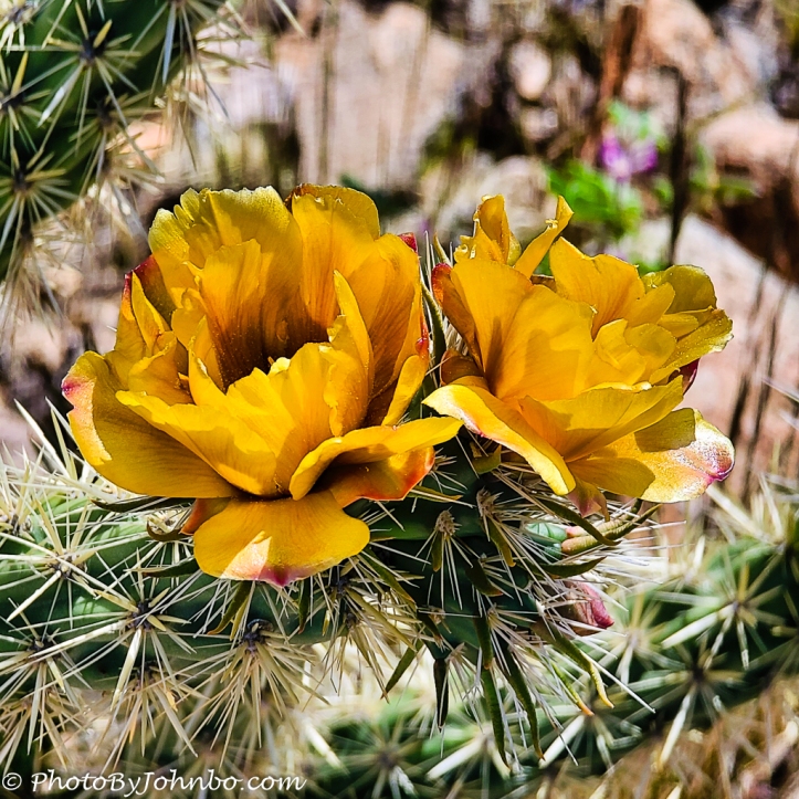 The image of Buckhorn cactus flowers was cropped for two reasons as well. Captured on my cellphone, the original photo was in portrait format leaving lots of extraneous plant above and below the image.
 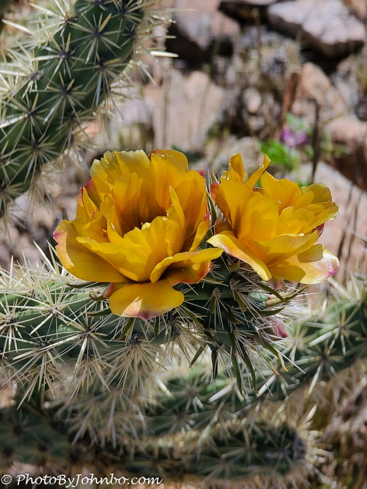 That also allowed me to change the aspect ratio from the camera’s normal rectangular format to a 1:1 format. The original image is 4000 x 3000 pixels, and the crop only dropped off about 500 pixels on the horizontal plane making it about 2500 x 2500 roughly. That’s plenty enough pixels to print on a canvas of some size, especially since the natural “grain” of a canvas is accepting of slightly lower pixel counts. The final version of this image may just end up on a canvas.
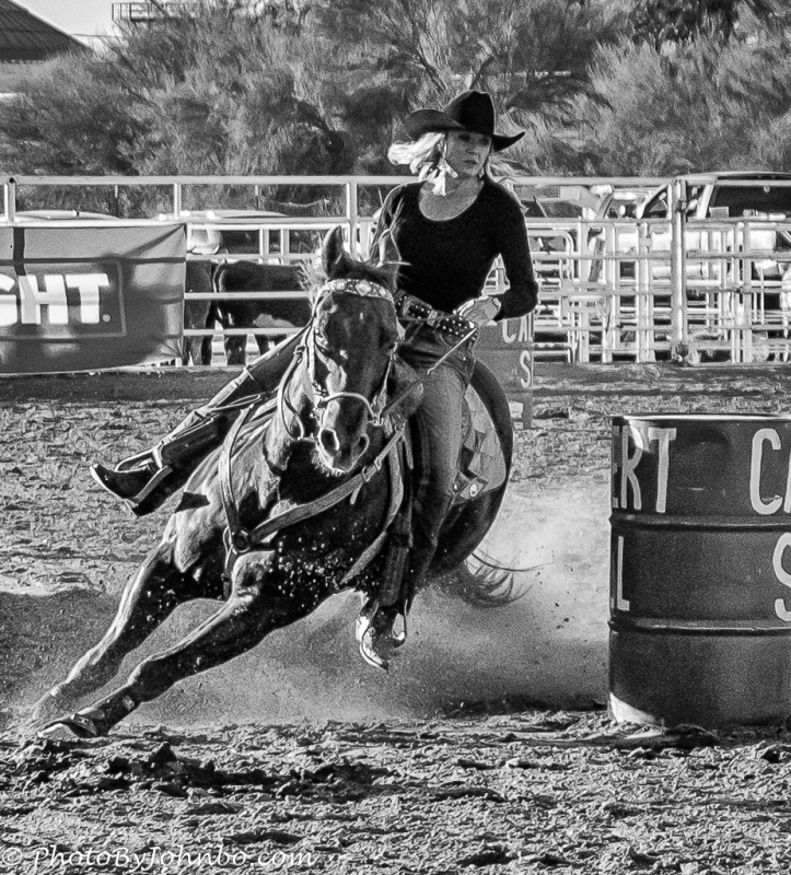 Action shots create a need for cropping in many cases. When things are moving fast, if you try to zoom in and “crop in-camera”, you might just miss the action. In fact, I almost always try to add a little “cropping room” even on landscape images to allow extra flexibility to focus on the subject in an attractive manner.
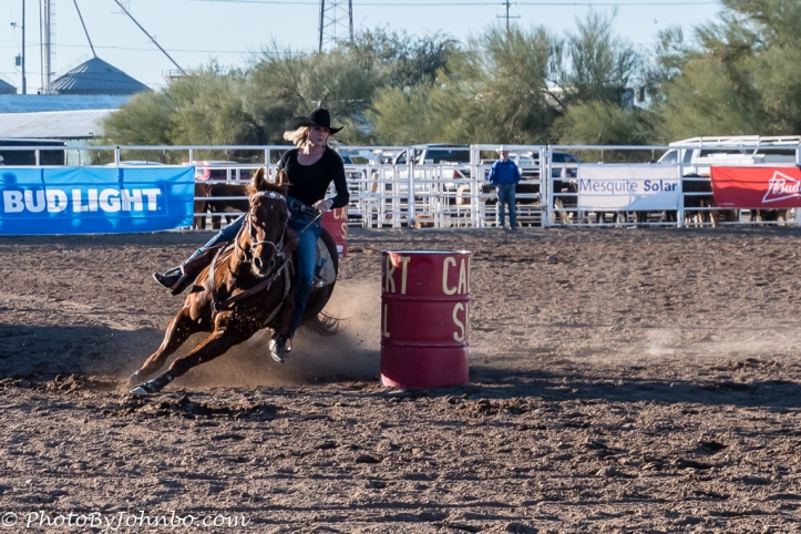 The barrel rider is one of my favorite black-and-white conversions. The only thing that could make the image better is if I could have shot it with a lens that would have given me a wider lens opening to allow the background to blur. I’ve experimented with masking and other tools to remove the background distraction to some success, but not enough to make any of those experiments an improvement. I’ve got some newer tools and this post has made me consider revisiting this image to see if I can blur the background to improve it.
Here’s another reason to crop… for a special effect. These two images were cropped, left and right, from a single image of a classic 1950’s era Buick. The reason for the weird crops: I wanted the two images to frame a window that needed to have something on the bare walls. Other tweaks to make this image work included masking to lower exposure in the extraneous background and convert the background to black-and-white to remove a distraction of that colorful blue car on the right.
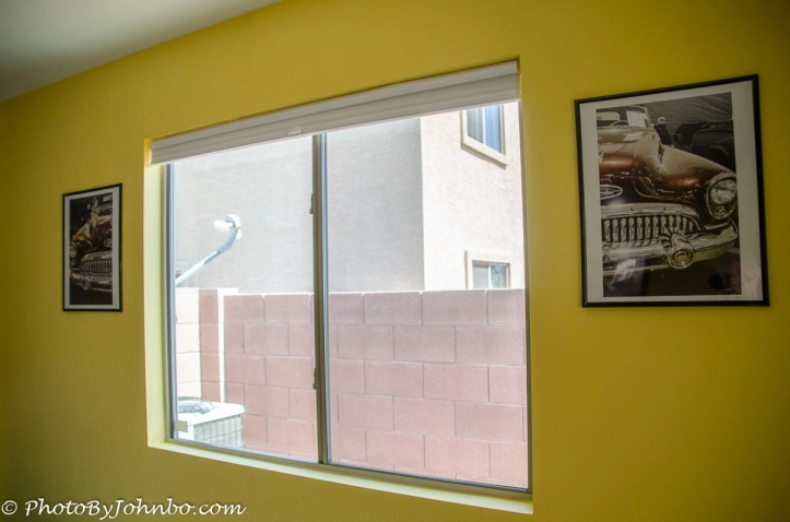 This image features the resulting prints mounted in cheap poster frames. For more details on how I put together this campy photo art, check out my blog post here.
John Steiner


Love seeing the “split” Buick photo you mentioned in a comment on my blog!
Stay safe and be well.
I always enjoy coming up with something different to play with. >grin<
Interesting shots!
Thank you!
Welcome!
Great post, John. I love your explanation of why and how you cropped the shots. “Splitting” the car grille is a clever idea. Now I’m thinking of how I can try that with one of my shots. I’m also glad you added the reasons of changing the dimension/orientation of the shot. 😊
Thanks! This challenge inspires me to check my archives for images that I could improve by re-examining with an eye toward cropping (or re-cropping). I like Lightroom’s Virtual Copy function as it will make rethinking easier.
I don’t use Lightroom, but I think I’m in the minority. 😊😊
I love that you used the car photos as art. Great idea. Kinda makes me rethink a few photos. My favorite was the rodeo rider. I am usually someone who loves color, and you were so right, the black and white defines the photo.Nice, and informational. 🤗
Thanks. Glad you like the car photos. I’d love to hear what you might do with that concept.
From a landscape stand point, wouldn’t monument valley be perfect? Probably divide it into three. Thanks again for the idea.
Monument Valley would be a great subject. I’d love to hear the format and media you decide to use if you go ahead with the project.
Excellent post on cropping – love your examples, and fun with the car split. Something to ponder…
Thanks. It was fun to create the images with that final idea in mind. I’d love to come up with some other interesting art involving multiple crops of the same image.
Love that photo John . The iguana reminds me of the lizard we saw in Costa Rica…they are called the Jesus Christ Lizard due to the fact they can walk on water. Lol..
I have seen those as well. Pretty cool how they can do that.
Excellent. Good choices on the alterations for that Buick photo, IMO. It looks great!
Thanks! Fun project and pretty simple (and cheap)!
Love the vintage car photos. Wonderful crops you have shown us. 😀
Thank you!
Excellent post John – your explanations were perfect. Love what you did with the car image, and definitely think you can blur the background of the rider. It’s one of my favorites of your images. Well worth a bit more time to make it perfect!
Thanks much. I plan to work on that rider image this weekend.
These results are excellent, John!
Thank you! Fun challenge this week.
[…] The Buckhorn Cholla cactus blossoms I found in the Arizona desert helped me show off the depth of field capabilities of the camera. This image was a snapshot captured in the 4000×3000 mode with auto-exposure and auto-focus. I can tap on the screen to determine the focus point I want, but if it’s “obvious” to the camera, I don’t have to bother. The standard lens size is 19 mm, and this image was captured at 1/610 sec., f/3.5, ISO 25. The photo above is right out of the camera, but with minimal tweaks in post-processing and cropping to a square format, the image below is the final result I liked it so much, I had it printed on metal. If these two images look familiar, you probably saw them in a recent Lens-Artists Photo Challenge post here. […]